Crafting Effective Chaos Error Messages
Maximizing user understanding and Minimizing frustration in unexpected situations.

DevRel @FifthTry || Ex-Product Engineer @Magic || Ex-SWE Intern @Economize || Open Source Enthusiast || Full Stack Developer
💡Introduction
Error messages are a common part of our online experience. Whenever a server is down, we lose an internet connection, or we forget to fill out the information on a form, we receive an error message. However, the classic "Something went wrong" message is not very informative. What exactly went wrong?
It's important to understand what happened and how to fix it. Therefore, in chaos engineering, error messages should be more meaningful and provide clear instructions on how to resolve the issue.
💡What makes a bad error message?
Error messages are part of our daily lives online. They inform us when something goes wrong, and help us understand what happened and how to fix it. However, not all error messages are created equal. A bad error message can leave us frustrated, confused, and unable to resolve the issue at hand.
💡Here are some common characteristics:
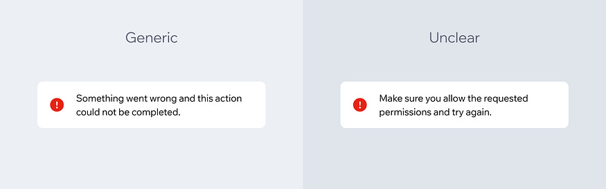
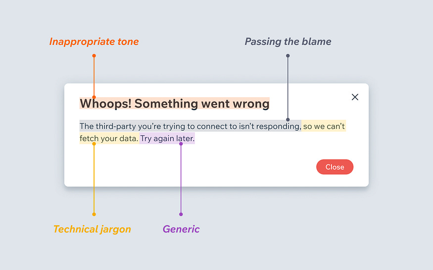
Uninformative: Error messages that simply state "Something went wrong" or "Error 404" without any further explanation or context are not helpful. They don't tell us what went wrong or how to fix it.
Technical jargon: Error messages that are full of technical terms or jargon that the user may not be familiar with can be intimidating and confusing. Users shouldn't need a degree in computer science to understand what went wrong.
Blaming: Error messages that blame the user for the issue can be frustrating and unhelpful. Instead of pointing fingers, error messages should focus on providing solutions and clear next steps.
Inconsistent: Error messages that look different from the rest of the website or application, or that are poorly designed, can be confusing and unprofessional. They should be consistent in style and design and should be easy to read and understand.
By avoiding these common pitfalls, we can create error messages that are clear, informative, and helpful for users.
💡What makes a good error message?
A good error message should be clear and concise, explaining what went wrong in a way that the user can understand. It should also suggest a solution or actions the user can take to resolve the issue. Additionally, a good error message should be friendly and not use technical jargon that the user may not be familiar with.
When crafting error messages, it's important to consider the context in which they will be displayed. For example, an error message displayed to a client user may need to be worded differently than an error message displayed to a developer.
By carefully considering the content and tone of error messages, we can create a better user experience and help users troubleshoot issues more effectively.
💡Here are some common characteristics:
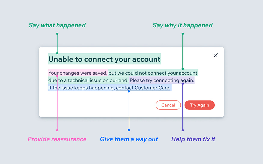
Clarify what happened and why: Make it super clear what did or didn’t happen. This can be done with a combination of visuals and text to explain errors and their causes.
Reassure users: Let them know what was not affected by the error, such as saved drafts.
Be empathetic: Use "please" when appropriate to show understanding.
Help users fix the issue: Give them clear instructions for fixing the issue or direct them to a knowledge base resource or article with a descriptive link like, “Learn how to resolve this” or “How do I fix this?”
Always give way out: If the problem persists or could reoccur, give them a Customer Care contact option.
💡Over to you
What's the best and worst error message you've seen?👀
Wrong answers only🫠
Let me know in the comments😀
💡 Article Reference: https://wix-ux.com/when-life-gives-you-lemons-write-better-error-messages-46c5223e1a2f
That's all for today.
If you enjoyed this content, please share your feedback and consider retweeting the first tweet 😀.
New to my profile? 🎉
Hey! I am Ayush, a full-stack developer from India. I tweet and document my coding journey 🌸.
Follow @ayushsoni1010 for more content like this 🔥 😉.


